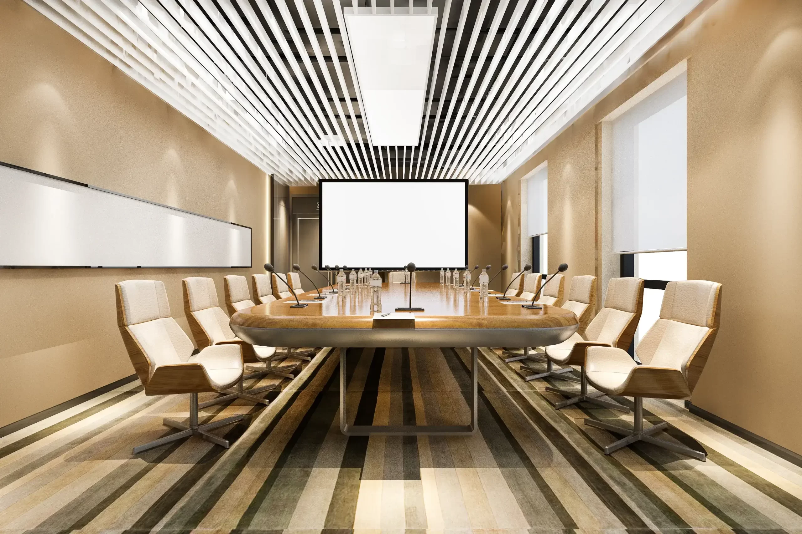
We are aware of how impactful colours are on your mood, the idea of this blog is to introduce the readers with the influence of colours. Since our childhood we have been attracted towards the concept of colours, growing up we have bifurcated them, their hues and shades into likes and dislikes. The darker and brighter colours, the lighter and duller colours have been in one team lately, not because they are categorised that way but we have categorised them that way. The reality check here is, every individual colour has various shades from light to dark, from bright to dull, and reflects light differently on the scale. Considering the fact, let us learn more about the impression of colours on the human mind, colour scheme and interiors.
Colour scheme, colour psychology for commercial interior design
What is a Colour scheme?
A colour scheme is a planned and decided combination of colours used in the design. This can be for anything from a painting or photo frame to a website to a commercial Interior. People use colour schemes to create a pleasing ambience to make things look visually appealing.
What do you mean by colour psychology?
Colour psychology is studying and details analysis or understanding of how colours affect the brain, our feelings and behaviour. It’s like secret communication language between colours and our minds!
Before we dive deeper into the theme, it is crucial that we recognise the beauty of colours and acknowledge difficulties that come along when we plan to finalise a colour scheme suitable for the place. Simply defined, colour schemes are the combination of colours used in the range of design disciplines. One decides the colour scheme based on their knowledge of colours and idea of the interior.
A very unpopular theory of colours and psychology shows the importance of colours in the healing process as practised in ancient times. Chinese and Egyptian culture shows the use of colours as a part of the healing process. Thus, supporting the theory of colours and their impact on the human brain.
Colours have shown a significant impact on the employees/consumers/visitor’s performance, personality, mental health, behaviour, relationships and many other aspects. Studies have shown that each colour develops a tendency in the person seeing it, let us understand how every hue influences a person:
Greener vibes:
Using biophilia, or shades which are greener, greener, and greenest reflects peace and growth. Interiors with a certain defined green shade give a calming effect.
People working in the space with green colour are more productive and in their comfort zone. Psychologically greener shades are tranquil and soothing.
Energies with red and hues
Red and other brighter shades like orange, reflects a greater sense of energy and passion. Cafes, the cafeteria of the office and other spaces where the audience, visitors, customers or clients need to be active, here’s the shade you must apply.
Red colour scientifically speaking increases blood circulation and improves the appetite, ergo, the idea of using red and other related hues in cafes, restaurants, and gyms can help.
Yellow
Yellow has a contagious vibe, it reflects happiness, good vibe, optimism, productivity and creativity. As per the colour psychology, yellow colour works best in the conference areas, workfloors and cafes.
Black, White and Grey
Black and white is forever love. The richness and neatness these colours bring to the platter is different from others. Black where reflects richness and elegance, and whites on the other hand reflect neatness and purity. Greys usually exist to balance out the contrast.
Conclusion :
People have a different theory about colours, and choosing the right one is the most difficult task which is why we have come up with the shades and their psychological impact which will help you to deal with this struggle with ease.
